How Web Developers Translate Design Systems Into Code
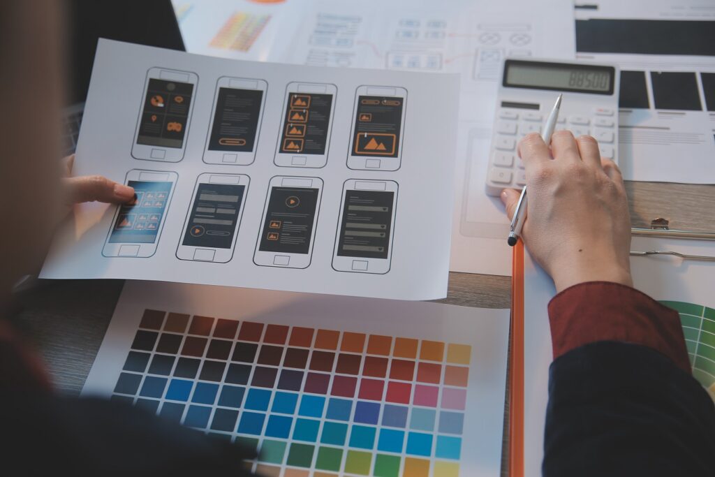
When I first started bridging the gap between design and code, I thought implementing a design system was just about matching colors and typography. Over time, I realized it’s way more than that — it’s about creating a living, breathing ecosystem that keeps every page consistent, scalable, and easy to maintain.
In this post, I’ll walk you through how I, as a web developer, take a design system and turn it into code that actually works in production — and how designers can make that process easier (and a lot more enjoyable for everyone).
What Is a Design System and Why Developers Love Them
A design system is more than just a style guide — it’s a collection of rules, reusable components, and visual patterns that define the look and feel of a brand.
For developers like me, it’s basically the source of truth for how everything should look and behave. When a design system is done right, I don’t have to guess what a button looks like or how much padding goes inside a card — it’s all standardized.
How Web Developers Interpret Design Tokens
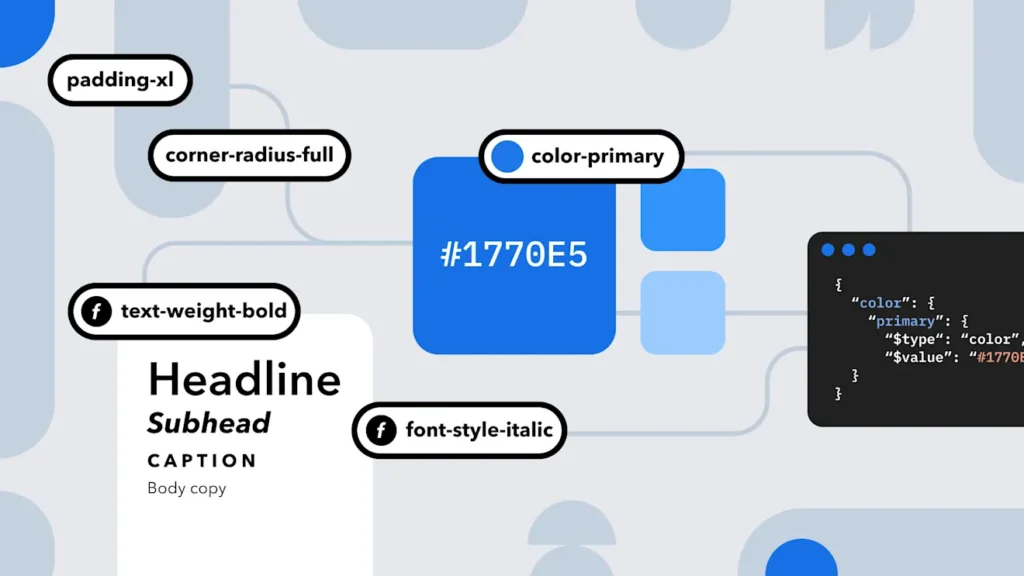
When I get access to a design system, one of the first things I look for is the design tokens — the variables that define the smallest building blocks like colors, font sizes, spacing, and shadows.
These tokens make it easy to maintain consistency throughout the codebase.
For example, if I see a token like –color-primary: #1A73E8;, that becomes a global variable in my CSS or Tailwind config.
Now, anytime I create a new component, I just reference these tokens — so if the design team tweaks a color later, I only update it once.
From Components to Code: The Implementation Process
Once I’ve got the tokens set, I start implementing components — reusable chunks of UI like buttons, inputs, cards, and modals.
This is where tools like React, Storybook, or Tailwind CSS come into play.
Each UI element gets built as a modular component that references the design tokens we set earlier.
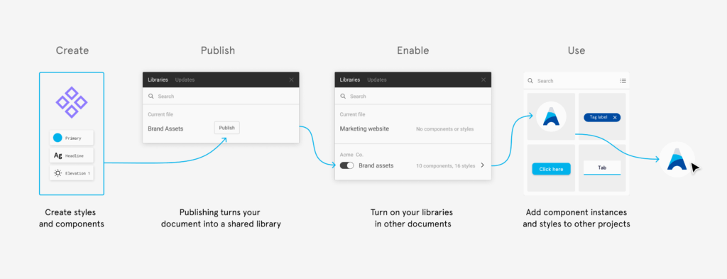
This process is like turning Lego blueprints into real bricks — each piece needs to fit together perfectly. Once the components are ready, I document them in a shared Storybook or front-end library for everyone on the team to use.
How Designers Can Create Developer-Friendly Systems
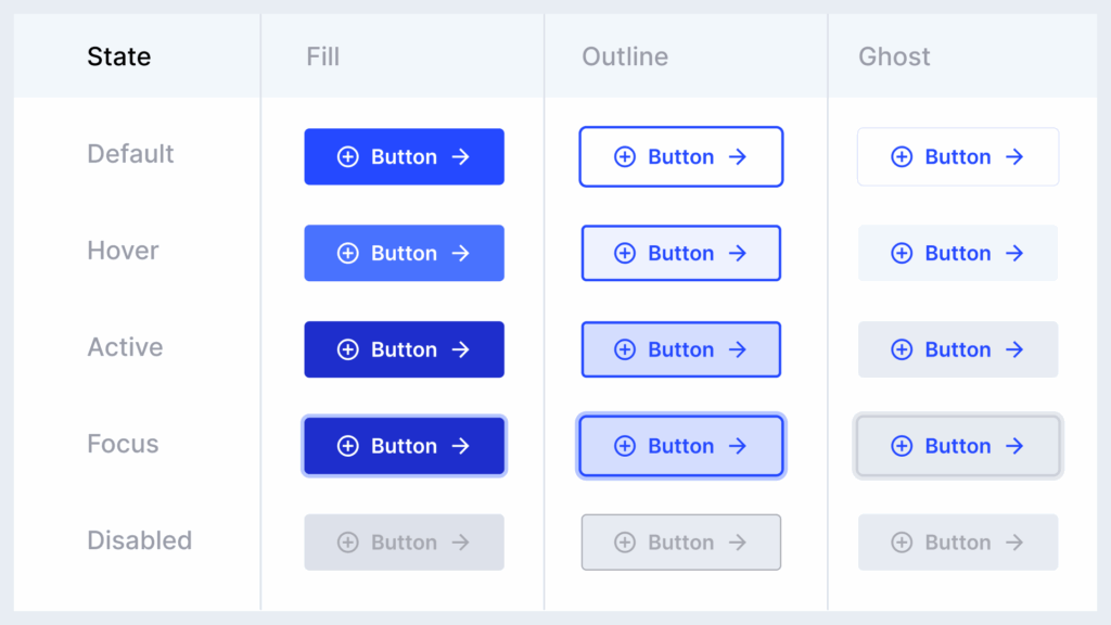
From a developer’s perspective, there’s nothing better than a clean, organized Figma file. Here are a few ways designers can make life easier for web developers like me: Use consistent naming conventions. Call it “Primary Button,” not “Blue Button v3.” Leverage Auto Layout and Constraints. This helps us understand spacing logic and responsiveness. Use Design Tokens or Styles. Don’t manually set colors — use reusable styles so we can map them easily to code variables. Document your components. A short note explaining states (hover, active, disabled) helps a lot. Provide examples of edge cases. What does the card look like with a long title? Or no image?
When designers hand off files that follow these principles, it speeds up development dramatically — and makes it easier to keep things consistent long-term.
Bridging the Gap Between Design and Development Teams
One of the biggest lessons I’ve learned is that communication beats documentation. Even the best design system can fall apart if designers and developers don’t talk regularly.
I like setting up short syncs where we review a component together in Figma and in Storybook. This helps catch misunderstandings early — like when padding doesn’t match or hover states look off.
Another great practice is to use the same language. If your design system calls something a “CTA Button,” don’t rename it “ActionButton” in code. Naming consistency keeps both teams aligned.
Why This Matters
When design systems and codebases are in sync, magic happens. Updates become easier, developers spend less time guessing, and designers see their work translated faithfully into the final product.
For me, it’s not just about writing cleaner code — it’s about maintaining a shared visual language between people who think in pixels and those who think in components.
The best projects I’ve worked on weren’t the ones with the fanciest animations or the trendiest UI — they were the ones where designers and web developers built together, in harmony.
